|
Happy Women's history month.
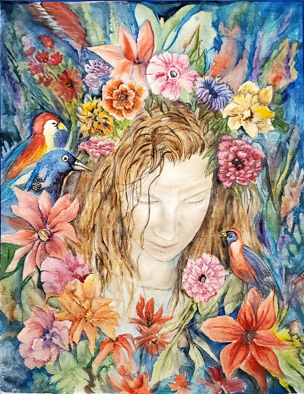
I am grateful to display this new watercolor at Gallery above the shelves in North Bellmore Library in homage to Frida Kahlo.
0 Comments
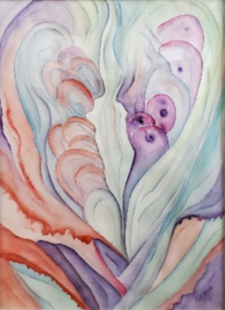
Georgia O'Keefe is renowned for her contributions to American Modernism. Best known for her close up, or large scale paintings of flowers. Her most current exhibit "To See Takes Time" is a collection of works on paper, and I was excited to see this collection at the MOMA when it came to NYC. To honor her as a favorite Female Visual Artist I have named my current show "It Takes Time To See". Other Quotes "I've been absolutely terrified every moment of my life and I've never let it keep me from a single thing that I wanted to do." ". . .from one window I see the road toward Espanola, Santa Fe, and the world." This watercolor "It Takes Time To See" was done for this show in honor of Georgia O'Keefe. It is not a replica, but in her style yet infused with my soul.
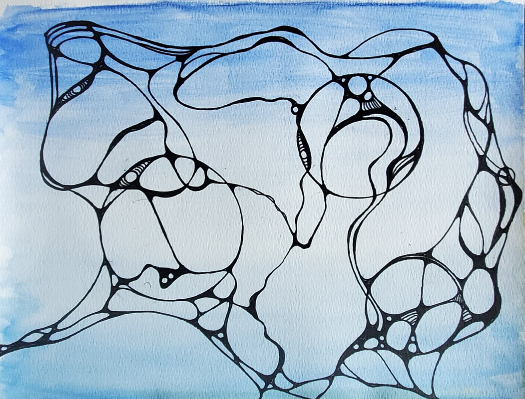
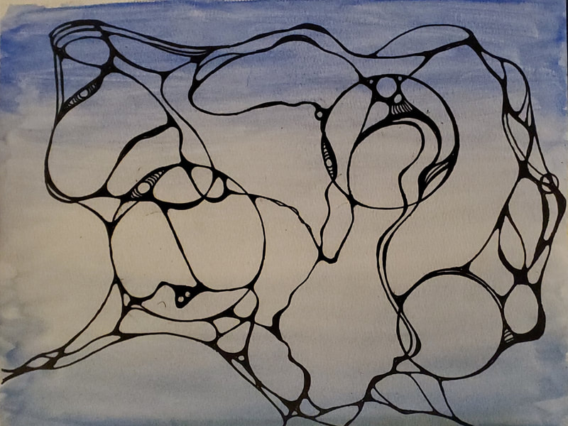
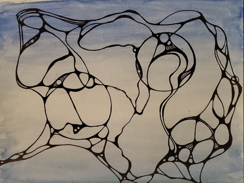
Here is a new finished piece 'New Connections' Below the finished piece you will see a few photos as a small example of the process used. The blue watercolor background was painted and dried before starting the drawing. This is different from what I did in the last post [drawing and then painted into it]. Below you can see a few stages of this process. Each piece will have a different start and many different steps from beginning to end. I took 3 photos as it developed.
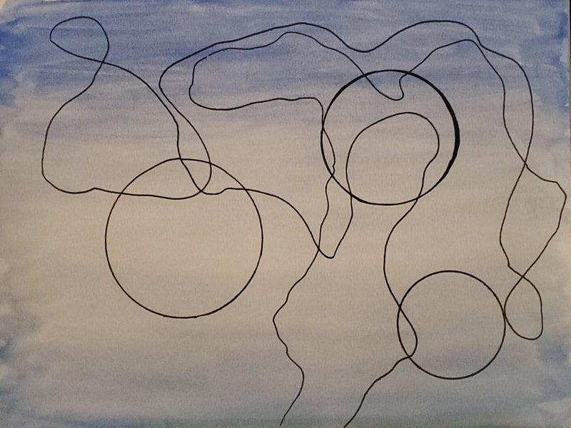
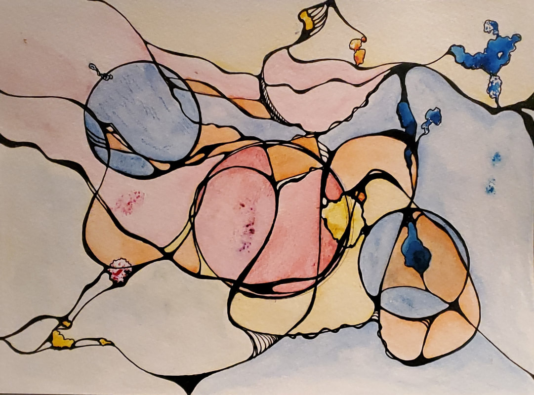
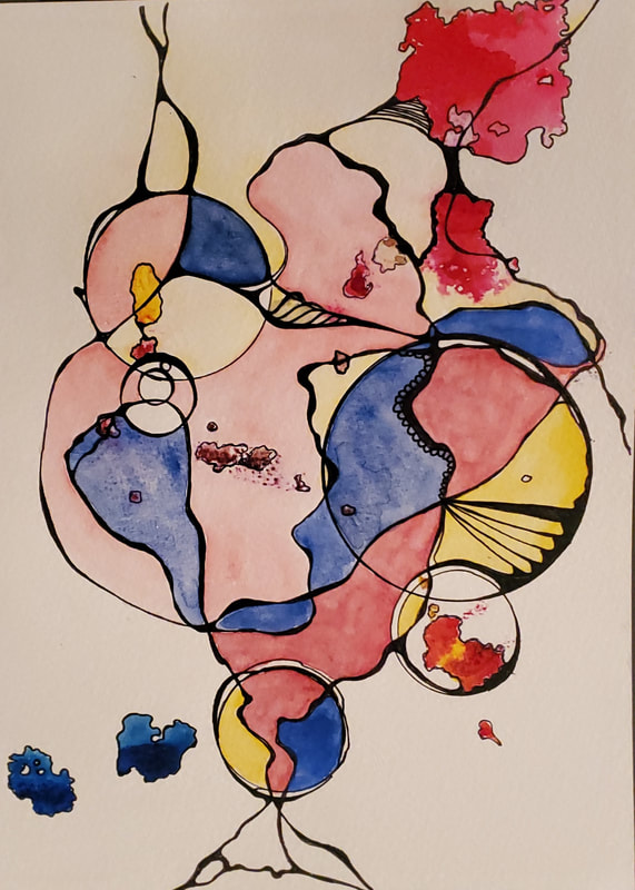
Photo 1: I began with 3 circles. To create these 1st lines, I used a micron pen and a crystal, pushing the crystal around the page. This is to prevent a predetermined line connection. You can use a penny or any coin. I used "Apache Tear". Photo 2: This is the point where your subconscious is given the opportunity to surface. This is a meditative and relaxing experience. Connections, can be added, enhanced, more circles may manifest, networks appear, no ego allowed, just let it flow. Then put it aside for a bit and see how it feels. Photo 3: At this point I see a few more neural connections coming through in the lower right circle. But after this, the work seems complete, so I am done. Final work as shown above. Relaxation through artistic process. A meeting of two minds - the conscious meets the subconscious Exploring a new meditative, creative method of art therapy, linking the conscious with the subconscious. This process is based on nuerographics, which is a way to work with your subconscious though the process of drawing. It is said that our outer world is a direct reflection of our inner world. this creative method is believed to stimulate new neural pathways, where neurons process information received. Art therapy for personal growth.
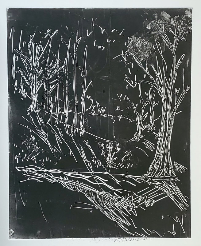
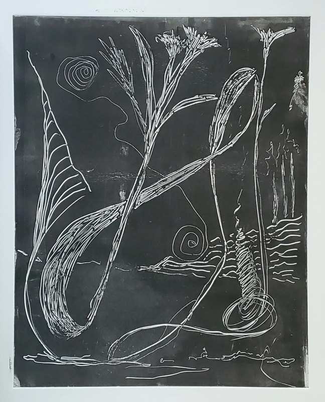
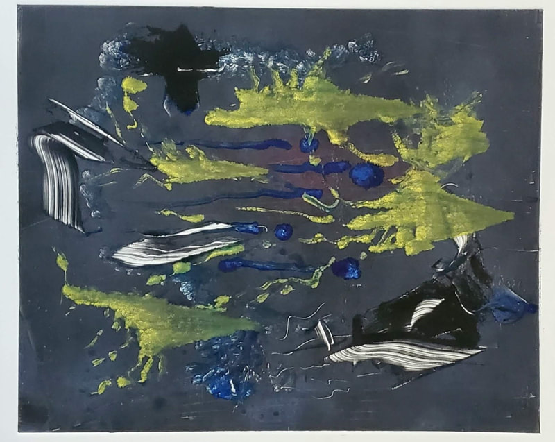
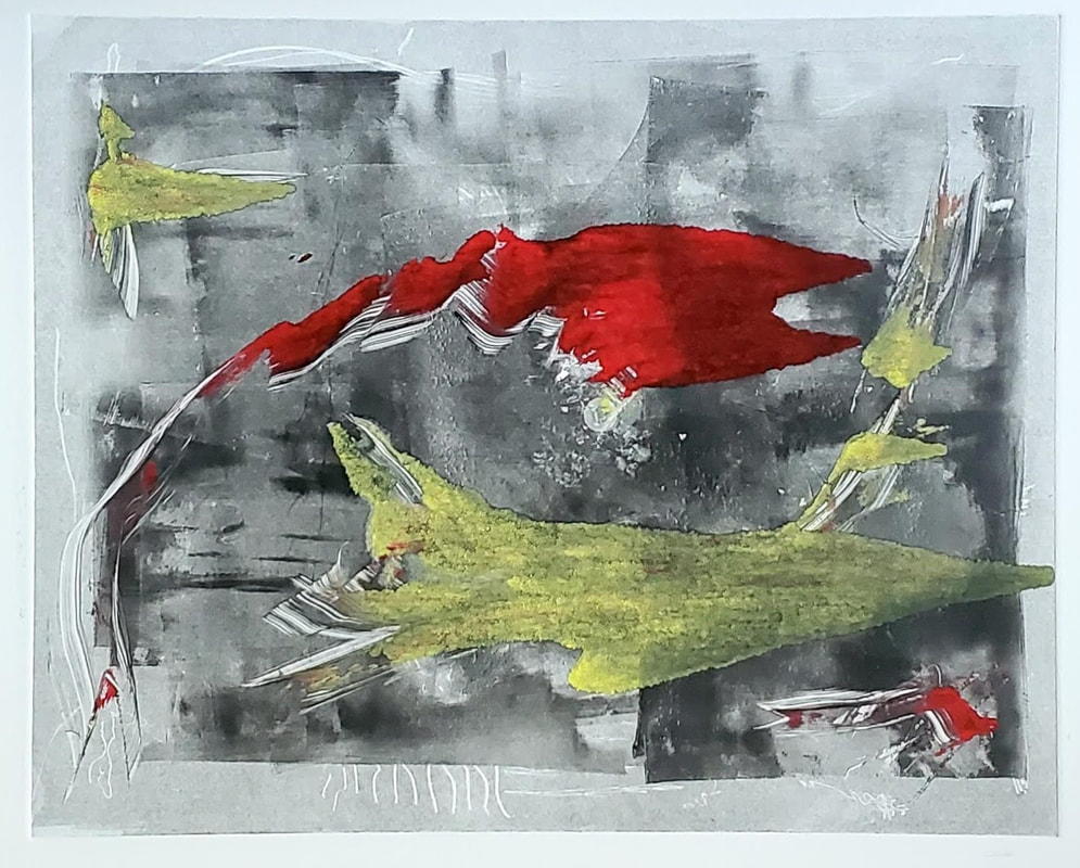
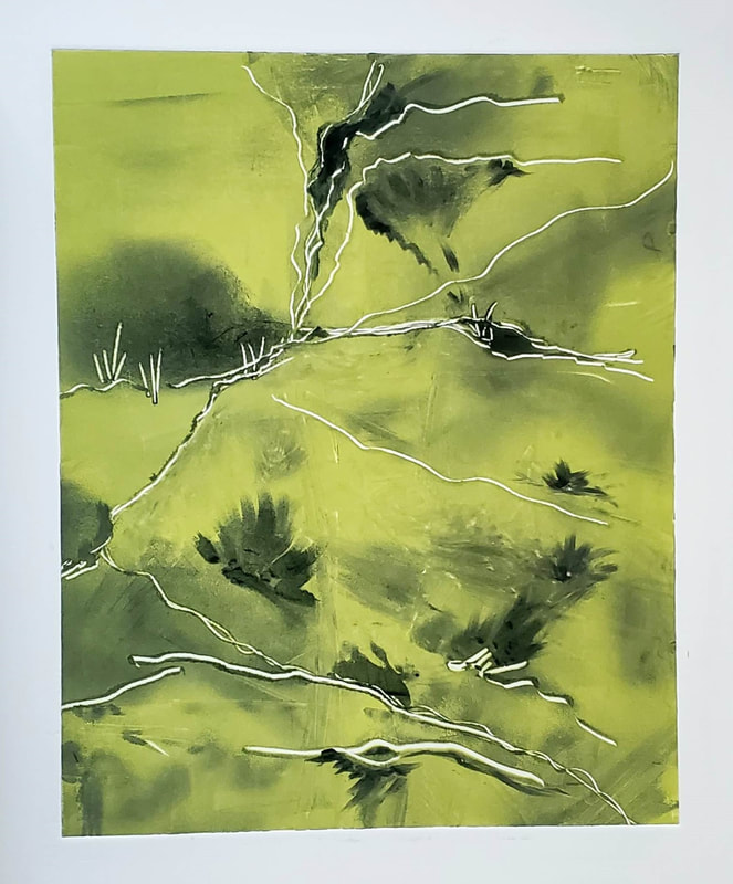
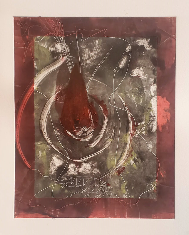
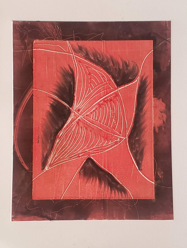
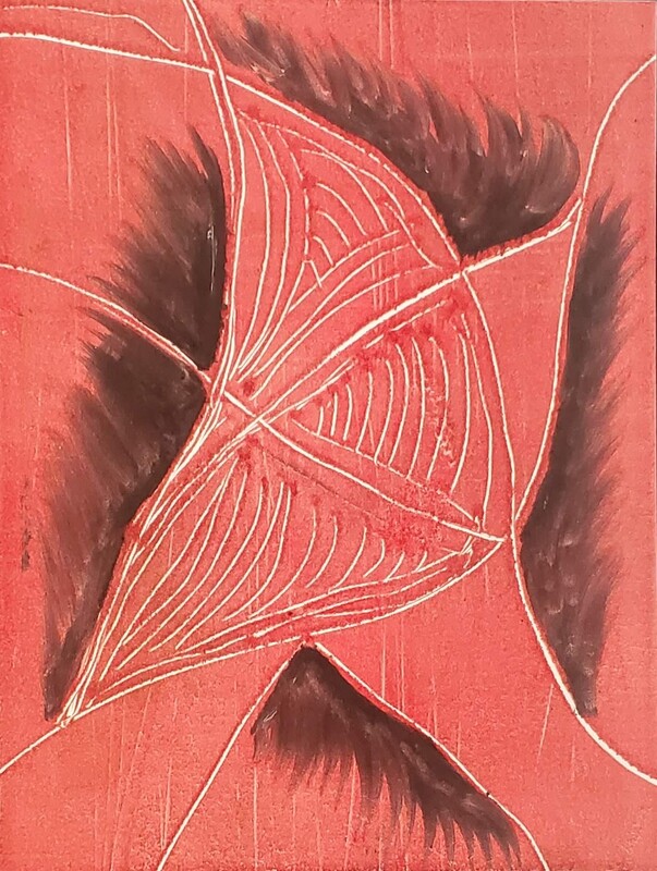
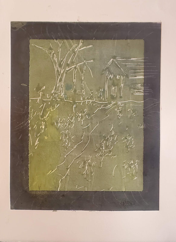
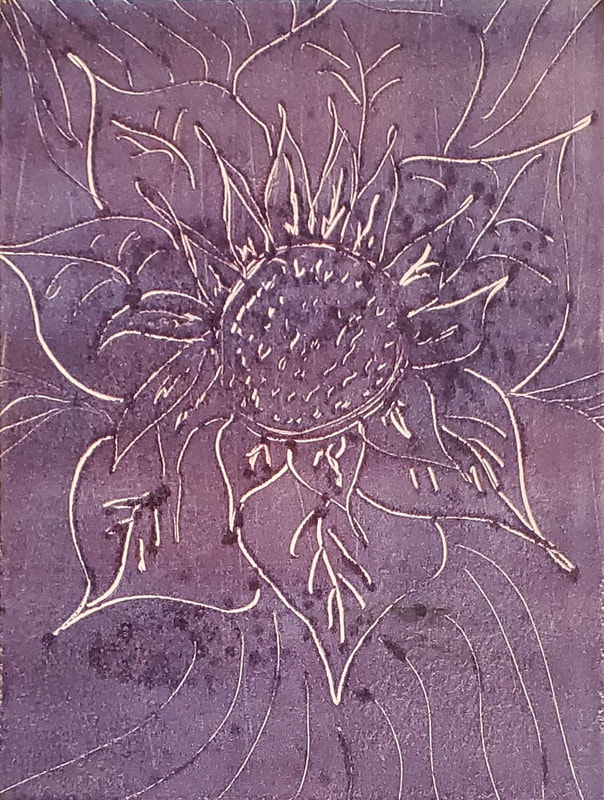
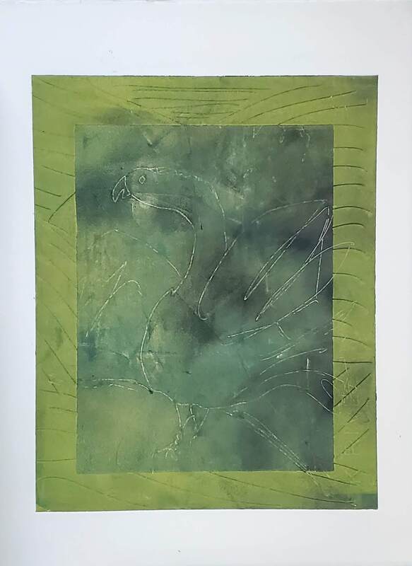
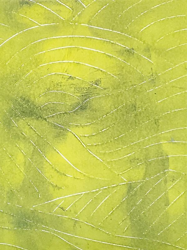
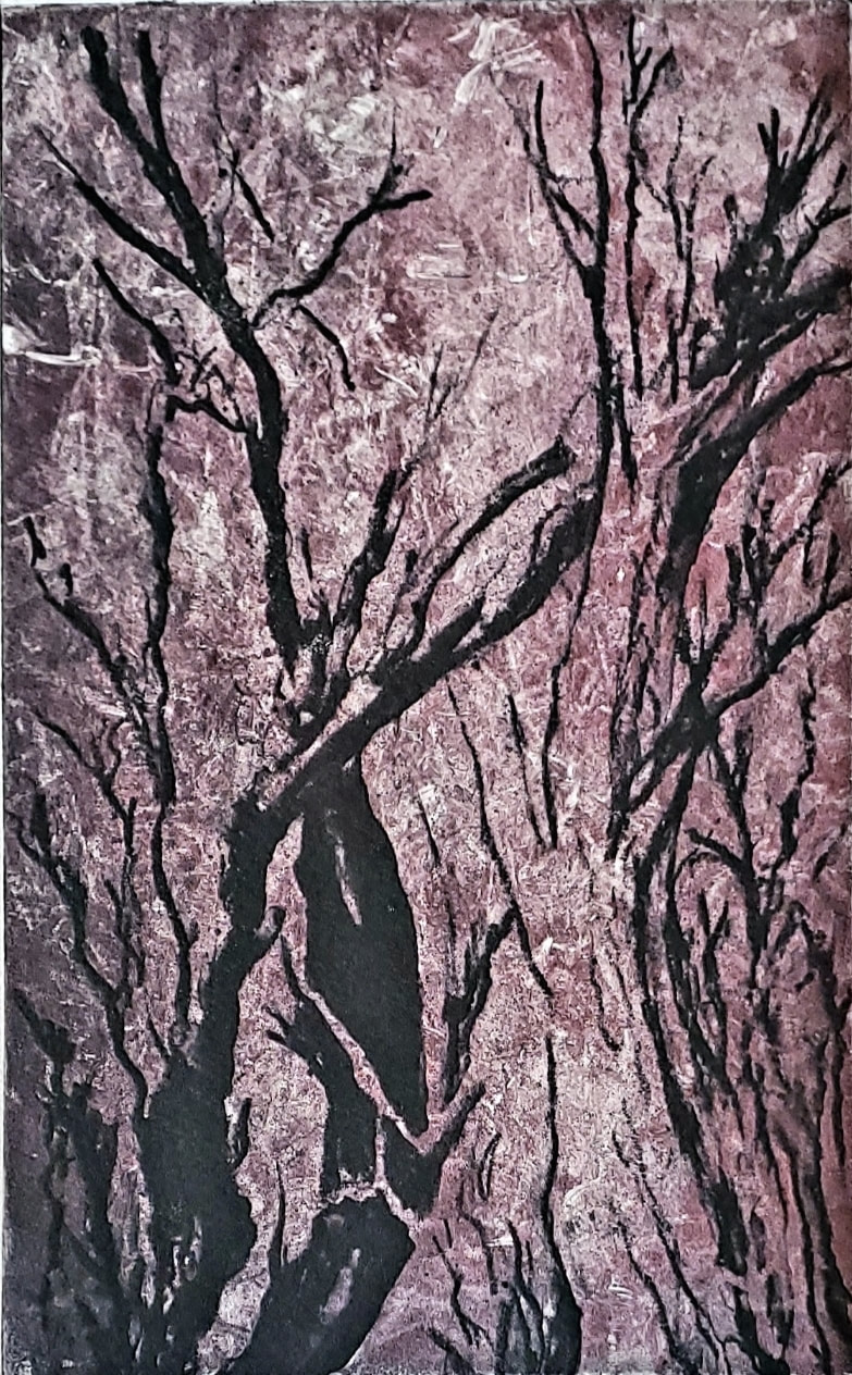
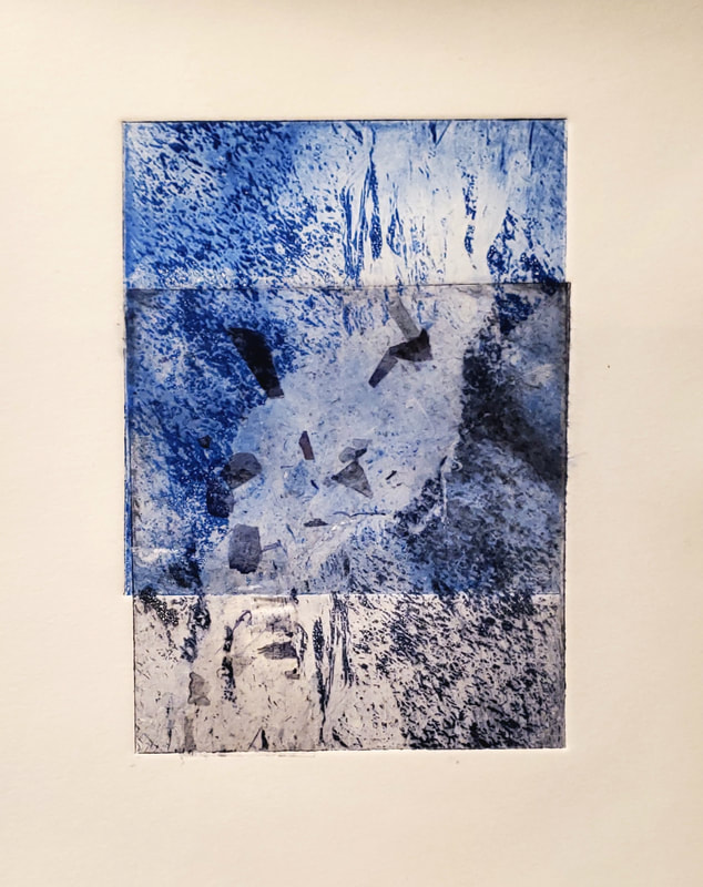
This is a meditative art technique, an innovative approach to healing by channeling stress and anxiety through drawing. You will surprise yourself by letting go, letting your subconscious evolve into works of art. Monotype etching is a type of printmaking made by drawing or painting on a smooth, non-absorbent surface. Each drawing or painting will only yield one piece of art. Hence the term "mono" type. These plates can be copper, zinc, glass, and I have been busy working with 8 x 10 acrylic plates to create some unique monotypes. Although it's been a while, I will try to document each different process and outcome in this post. The pieces you see below are all hand painted on an acrylic plate with akua inks. Once each plate was ready, I pressed it onto Rives BFK etching paper using a Conrad E-12 Etching Press. For the two pieces above, I started by inking the entire plate, then created the images by using a scratch board process of removing ink in fine lines with an etching tool. Then each plate was printed as described above. The three pieces seen above, the plate was hand painted, and then scratched into with etching tools before being pressed. The above piece was a two step process. I first printed the plate with the inside design and color on the entire piece. Then I inlaid a smaller 6 x 8 piece od paper over the center, reprinted the plate with red and black inks additional scratchboard work as seen below, printed and removed the center paper leaving two pieces, the 8 x 10 above and the 6 x 8 below. I did the same two step process with two additional works. Below you see the two pieces separated, but on careful inspection, you can see the scratchboard work that overlaps in each, as well as the color overlay. Experimenting with new techniques is always very rewarding. You just never know what might happen, but the process is as exhilarating as a 5K run. Good for the mind and soul!
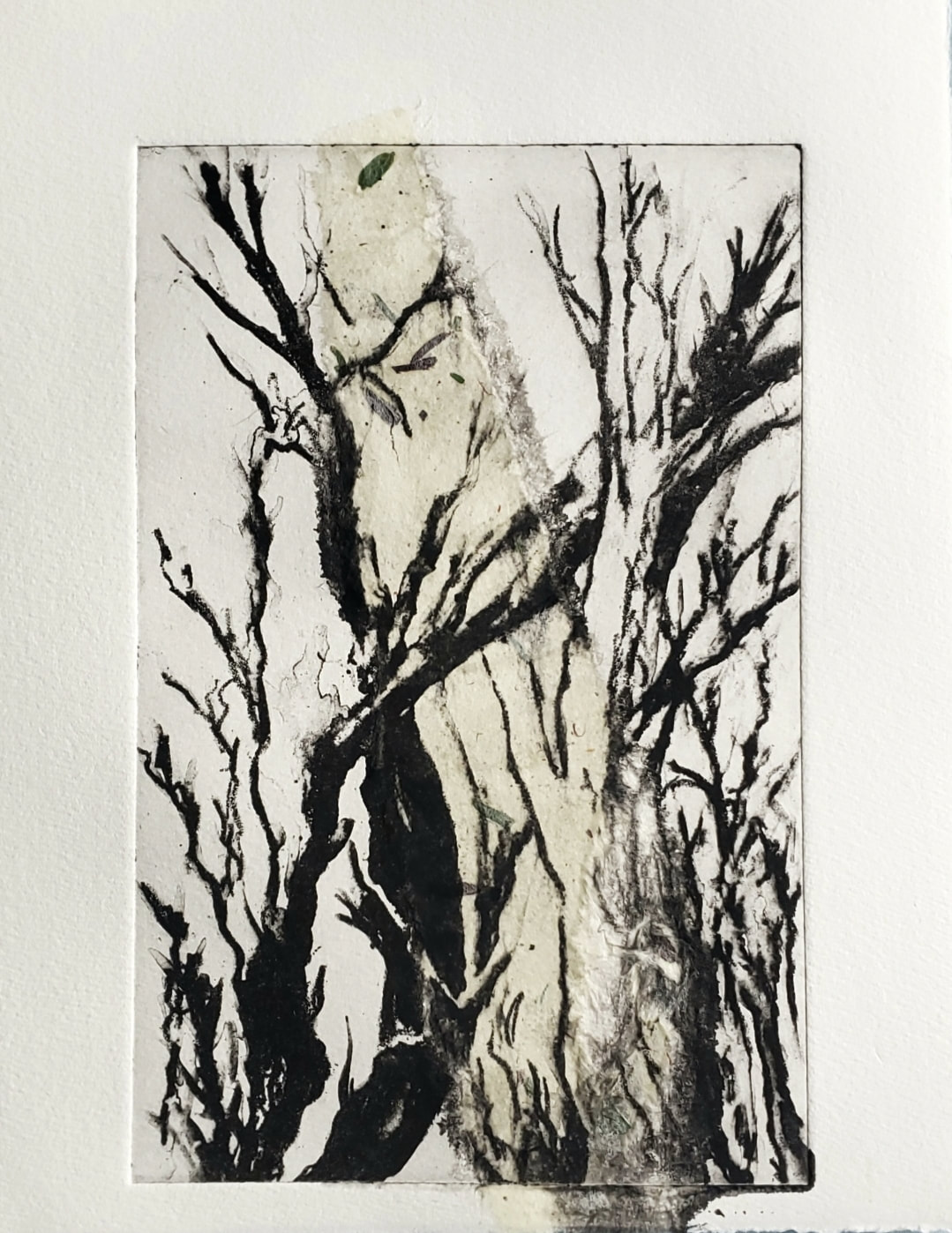
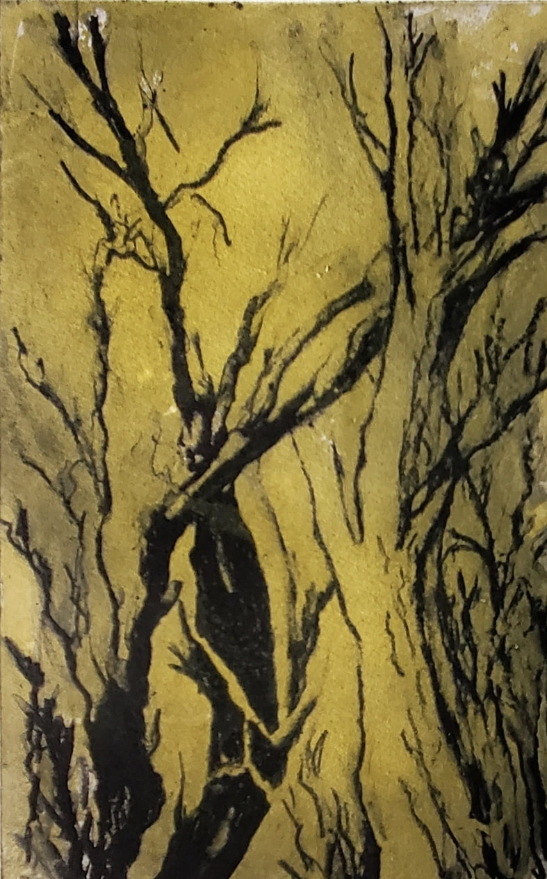
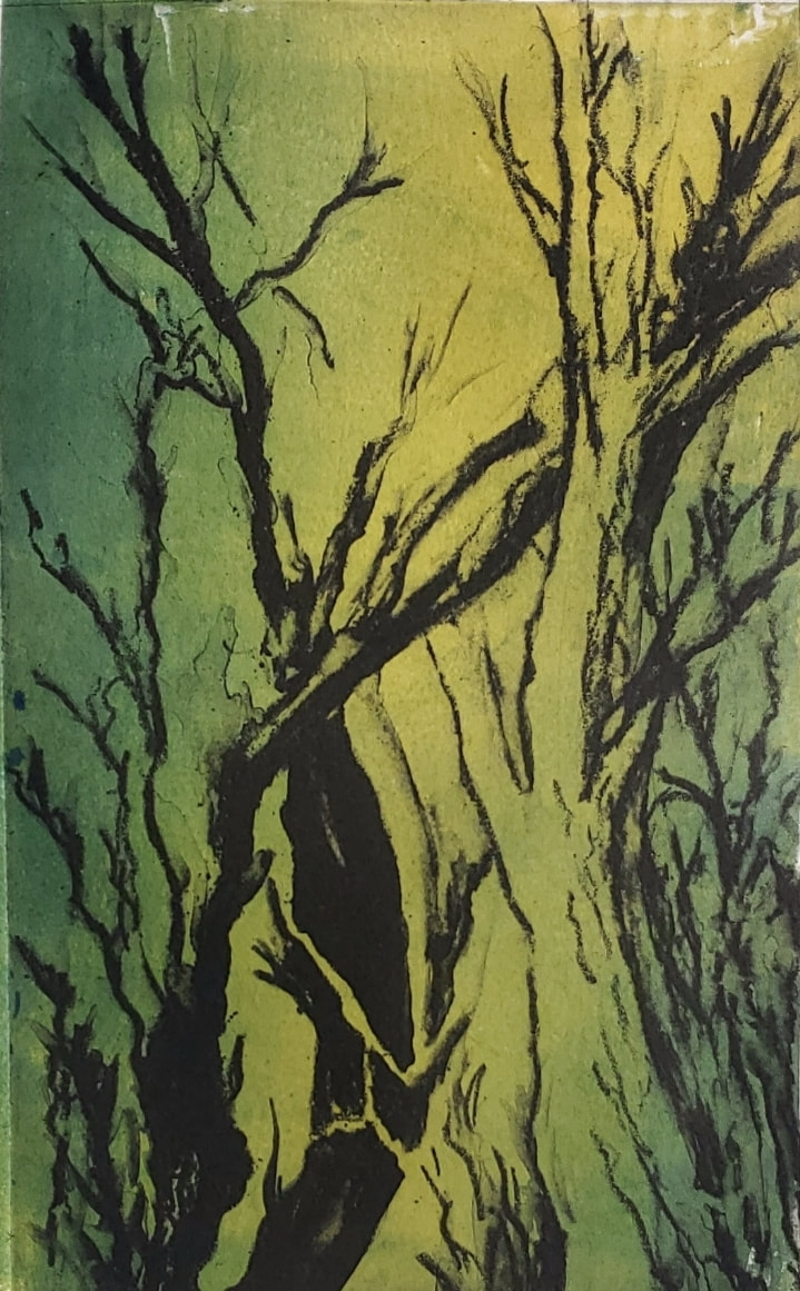
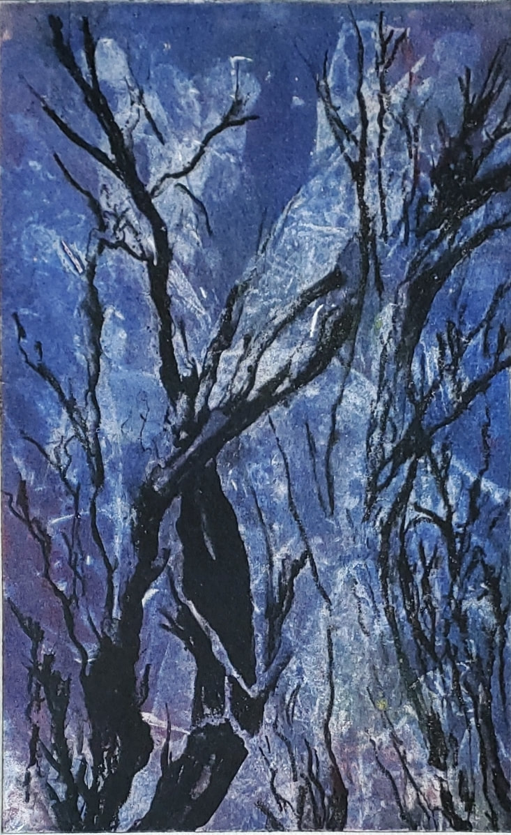
This is a watercolor painting done from a wedding photo shared with me by the groom himself. The photo is taken at the fountain in front of Jedediah Hawkins Inn in Jamesport. The groom is the proud owner of this classic Mustang, so I was excited to be able to paint them together with it. The slideshow will exhibit the various stages I took in creating this painting. I would love to hear from you. Feel free to leave any thoughts, comments or questions below. I am truly grateful anytime I can get out into nature and paint. The days are lovely, the energy is abundant and being able to walk the grounds, helps me connect to the feeling and energy of my subject. On this particular day, I was joining some plein air friends on the grounds at Old Westbury Garden. The day and event were just lovely. It was a bit of a warm day, so finding shade is essential for comfort and wellbeing. Luckily there were plenty of majestic trees to sit beneath, a tiny breeze off the water's edge, and the friendliest gaggle of geese to hang with. Below are 3 photos of my process. First up is a rough graphite sketch of my composition, just to lay in the key areas of the painting. Second photo shows my first watercolor glaze. This adds the lights and color values throughout the composition. Next I add 2 or 3 more glazes to get in the mid tones and darks. Plein Air Motto: Keep it loose, keep it simple and keep it up! I will be leading a Plein Air workshop at Down's Farm Preserve in August. See homepage for details. Please feel free to post questions or comments below. This is a 5 x 8" solar plate processed with an aquatint screen and then an etching on acetate. It was printed with Akua black ink and a chin-colle mulberry strip. It seems that when an aquatint screen is used to process the plate, it picks up shadow and fine detail. You do not get a deep bite in the plate which makes including a relief over the intaglio inking a bit more challenging. As I rolled a relief color on the plate, I could see it picking up the black ink in the grooves, changing /muddying the relief [background] color a bit from it's original vibrant yellow to an ochre. Just an observation in the exploration, nothing wrong with ochre. Here I added a bit of phthalo blue to the yellow on the roller ink. I rolled the plate with blue akua ink, but then after past examples, I felt less ink would be a better outcome. The thick ink seemed very flat. On this blue piece, as an after thought, I used a crumpled sheet of newspaper to rub off some of the applied ink before pressing. I was extremely surprised and excited by the outcome. I loved the texture that was created in the paint. It appears to let in the light, allowing the white of the paper to peek through. Loving this outcome so much I decided to try and recreate this effect. I inked up the plate in red and the result of the process is below. Both are fabulous but I like the blue outcome better, probably because I over thought the red one . . . taking off paint everywhere instead of a few spots. But that is my humble opinion. It might have been the element of surprise that draws me to the blue one. Or perhaps it is because I am always drawn to blue . . . Ok, why not one last try - The Ghost Print I again used newspaper to remove ink, only being more mindful to leave the randomness of the texture and light. Notice the black ink is much lighter and chalky looking on this print. That is because it is a ghost print. A print that is pressed without reinking the plate, allowing the image to be much lighter and ghost like. 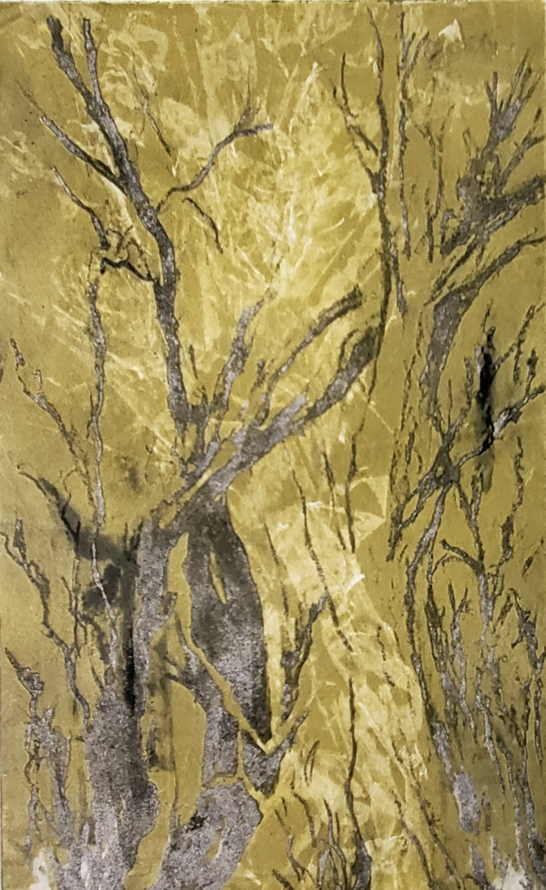 All comments, questions, thoughts and suggestions welcome.
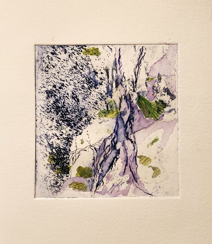
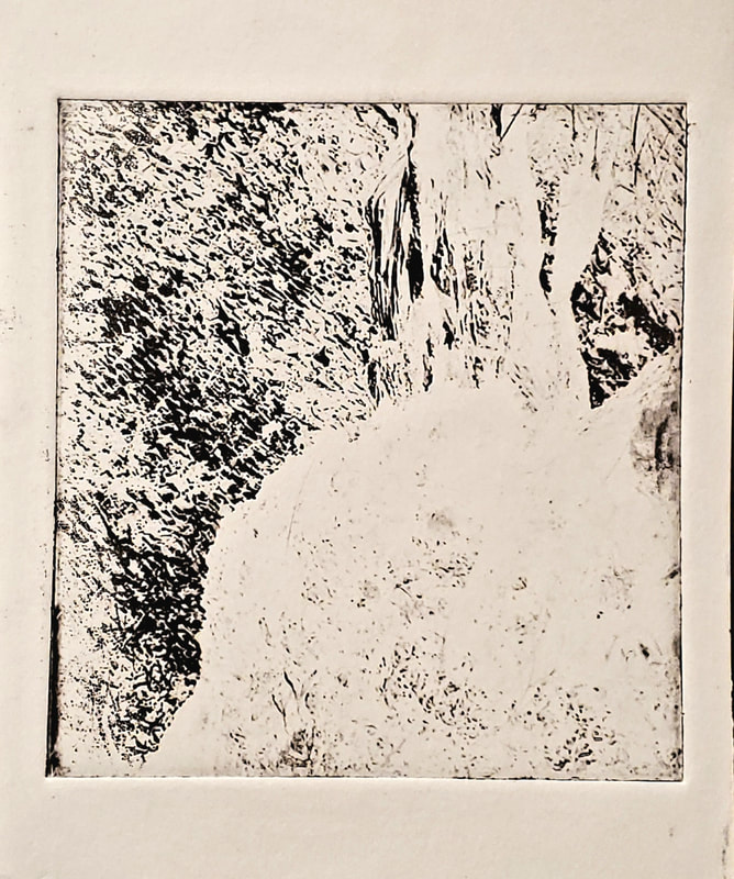
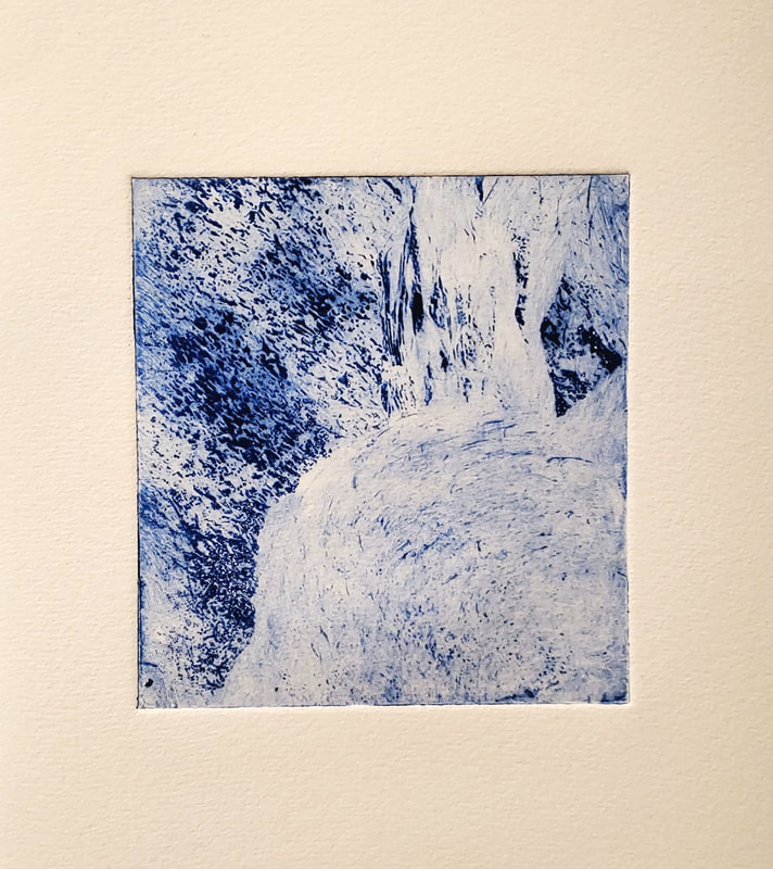
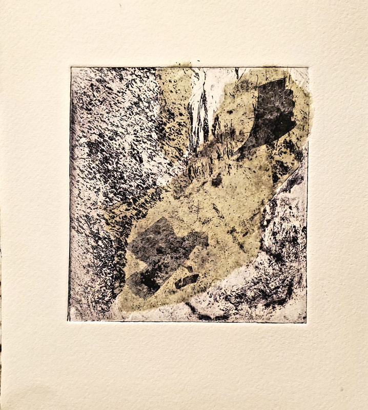
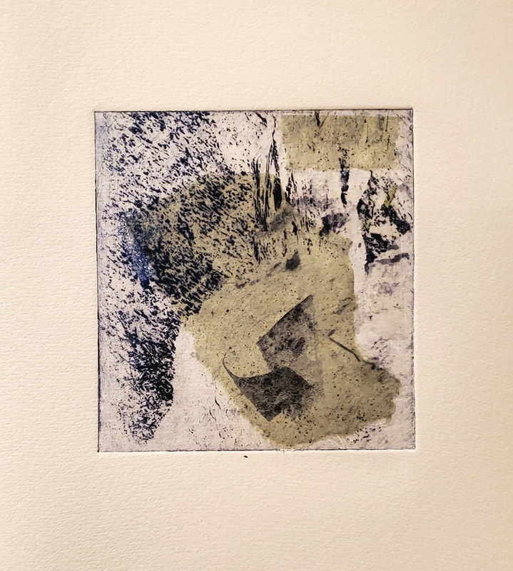
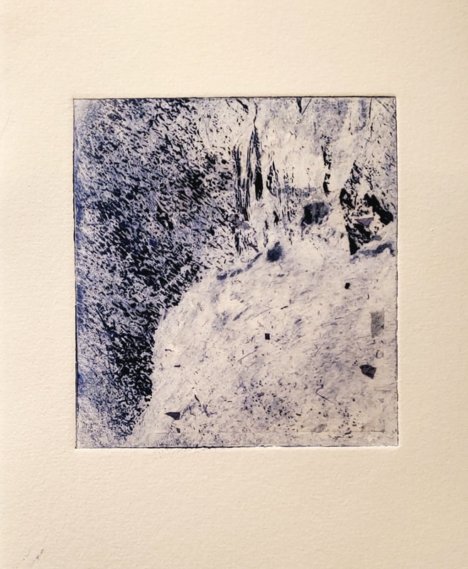
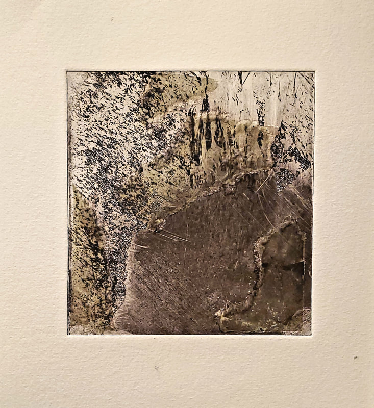
Thank you for joining me on this artistic discovery journey. Wishing you all love and light! Inspiration abounds when we are given the opportunity to participate in the artistic process. After seeing a talk / demo by master printmaker Dan Welden at Gallery 11 West, it resurrected my urge to get back to exploring the intaglio printmaking process. At a current CEEDs workshop with Dan and East End Arts workshop with ChrisAnn Ambrey, I created a few small solar plates that I have been working with. Here you will see a few different monoprints that all started with the same 4 x 5" plate. Intaglio, aquatint, chin-colle, additive and subtractive color . . . explore the process and embrace the results. You can never quite "see" what it will be until it is unveiled on the press. The print on the left is intaglio print with black ink. I did not get tremendous detail in the lower right circular area because I decided to process my etching screen without an aquatint process. I was interested in seeing what would happen. The aquatint would have allowed more of the shading detail to come through, without it only the darks and lights are very processed. But sometimes less is more. I have been having so much fun with this mighty and powerful little design. Second printing, I added a bit of color, used a brush to add circular detail and rubbed less ink off the plate before printing. These two monoprints include Chine-colle, including thin pieces of mulberry paper. These two are experiments with the inking process and imbedding different mulberry pieces. This example is the plate double pressed with an offset. Although this is interesting, there is so much I can see to change the outcome of this idea. One color, full offset, minimize the edge ink. I'm open to all suggestions. ALL COMMENTS WELCOME!
|
Archives
March 2024
|
