|
Current Work and Reflections
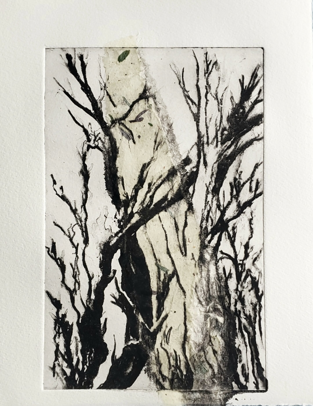
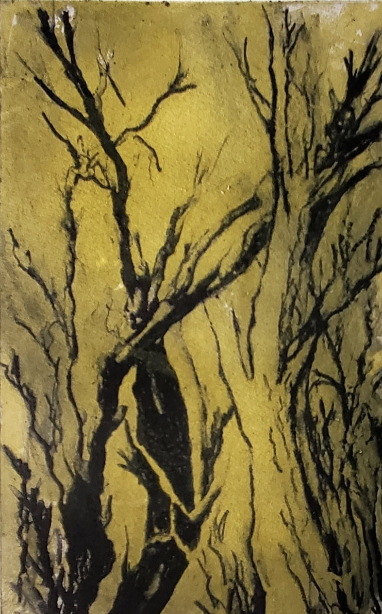
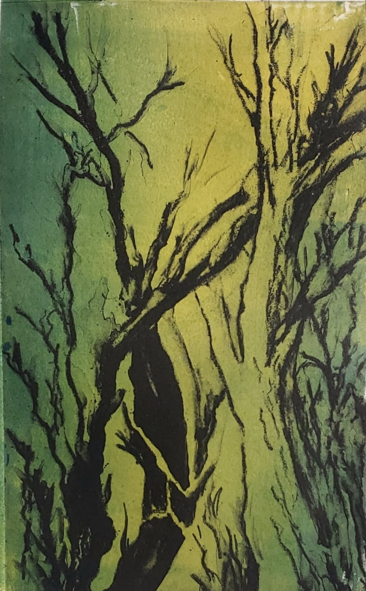
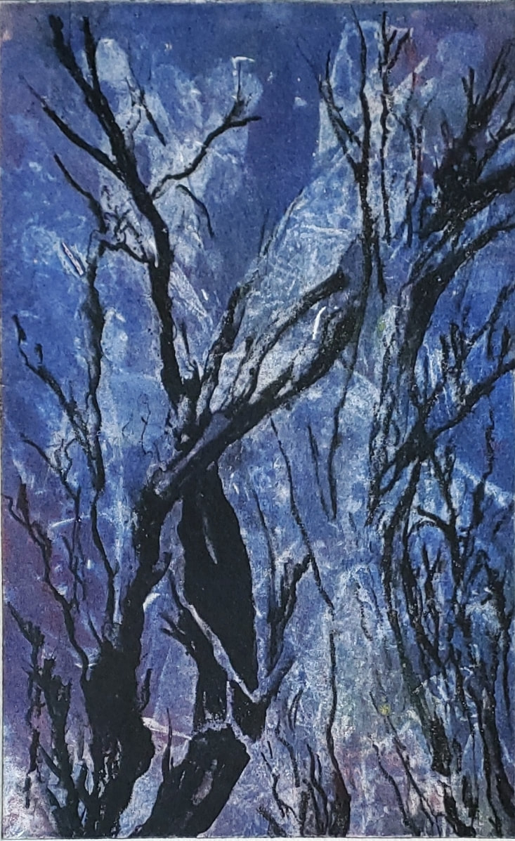
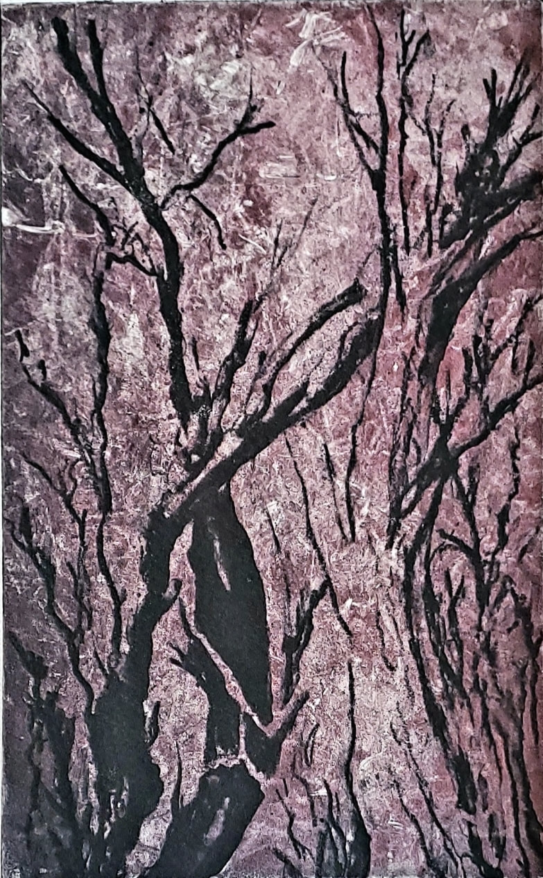
This is a 5 x 8" solar plate processed with an aquatint screen and then an etching on acetate. It was printed with Akua black ink and a chin-colle mulberry strip. It seems that when an aquatint screen is used to process the plate, it picks up shadow and fine detail. You do not get a deep bite in the plate which makes including a relief over the intaglio inking a bit more challenging. As I rolled a relief color on the plate, I could see it picking up the black ink in the grooves, changing /muddying the relief [background] color a bit from it's original vibrant yellow to an ochre. Just an observation in the exploration, nothing wrong with ochre. Here I added a bit of phthalo blue to the yellow on the roller ink. I rolled the plate with blue akua ink, but then after past examples, I felt less ink would be a better outcome. The thick ink seemed very flat. On this blue piece, as an after thought, I used a crumpled sheet of newspaper to rub off some of the applied ink before pressing. I was extremely surprised and excited by the outcome. I loved the texture that was created in the paint. It appears to let in the light, allowing the white of the paper to peek through. Loving this outcome so much I decided to try and recreate this effect. I inked up the plate in red and the result of the process is below. Both are fabulous but I like the blue outcome better, probably because I over thought the red one . . . taking off paint everywhere instead of a few spots. But that is my humble opinion. It might have been the element of surprise that draws me to the blue one. Or perhaps it is because I am always drawn to blue . . . Ok, why not one last try - The Ghost Print I again used newspaper to remove ink, only being more mindful to leave the randomness of the texture and light. Notice the black ink is much lighter and chalky looking on this print. That is because it is a ghost print. A print that is pressed without reinking the plate, allowing the image to be much lighter and ghost like. 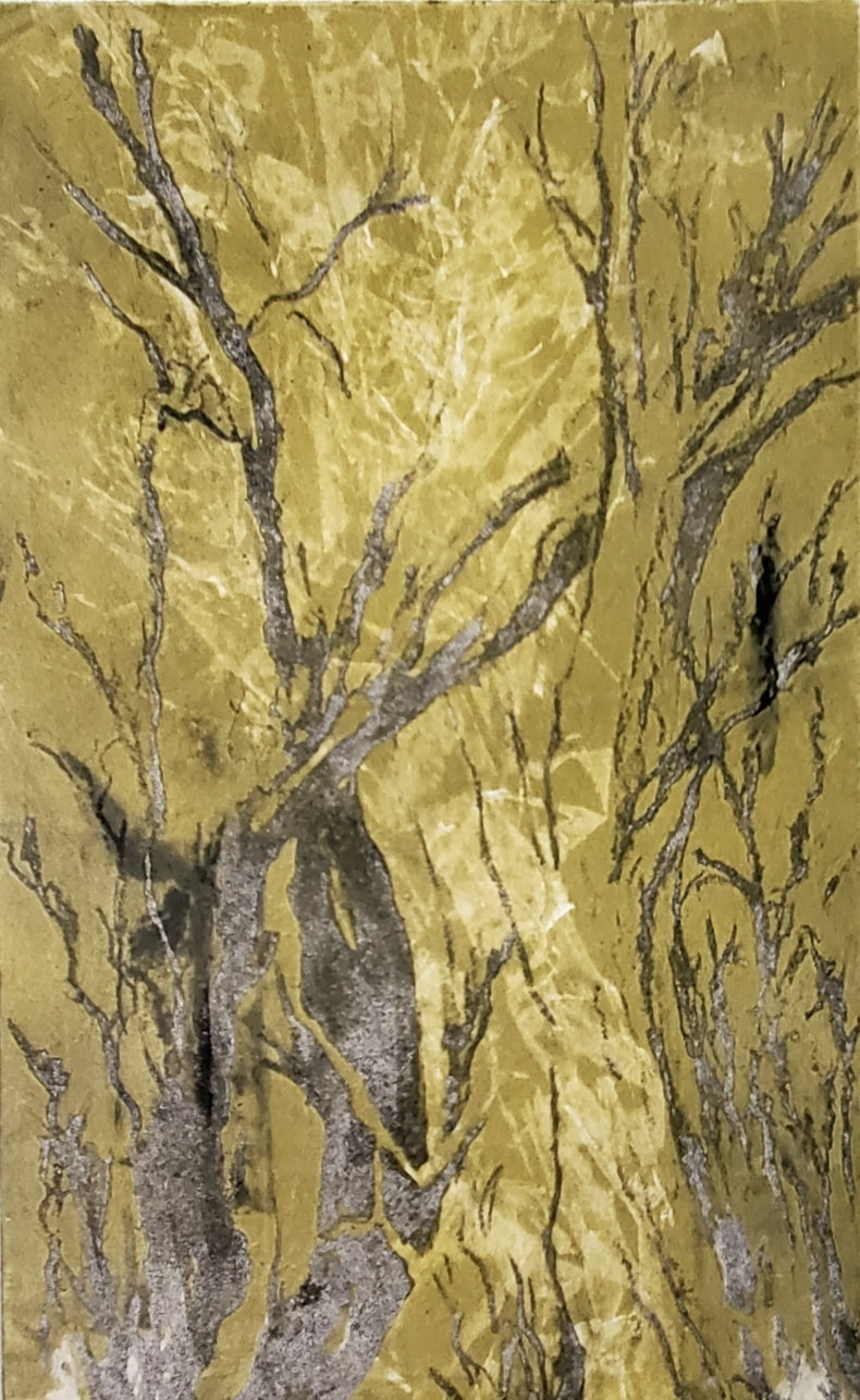 All comments, questions, thoughts and suggestions welcome.
Thank you for joining me on this artistic discovery journey. Wishing you all love and light!
2 Comments
Carmine Battista
6/10/2023 10:31:24 pm
Funny—I actually like the red on rhe most. It makes me feel warm and cold at the same time. The red makes me feel like fire and the white specs make me feeling like it’s snowing. I get you like the blue for its “surprise factor” or your blue preference, but my pic is red (and blue is my favorite color)
Reply
Jan Livingston
6/11/2023 07:21:37 am
I really like each of them for different reason. But what I like most is the process you are going through to make each one. Thank you for sharing!
Reply
Leave a Reply. |
Archives
March 2024
|
